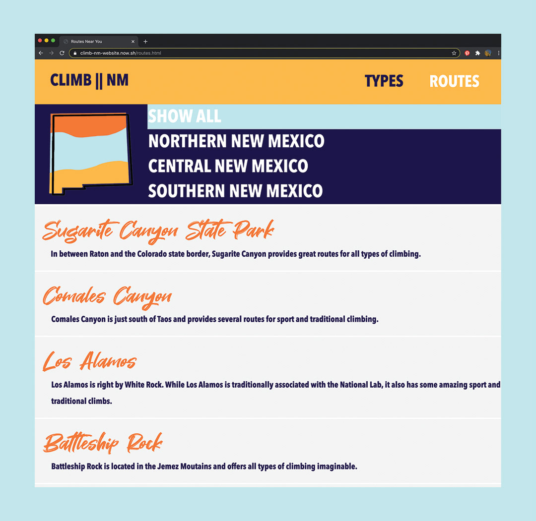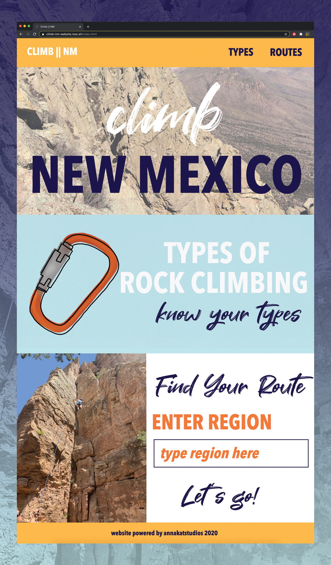
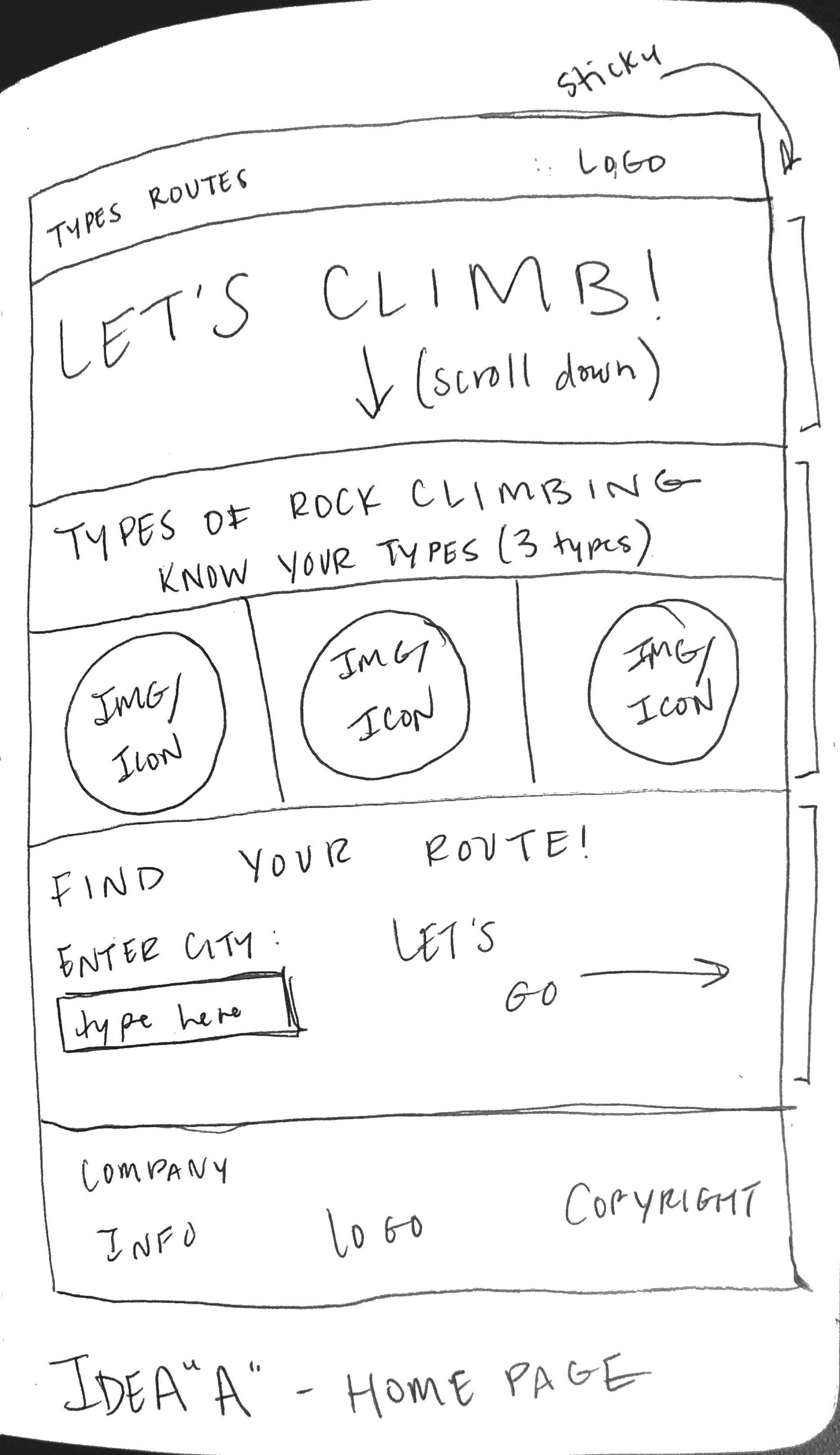
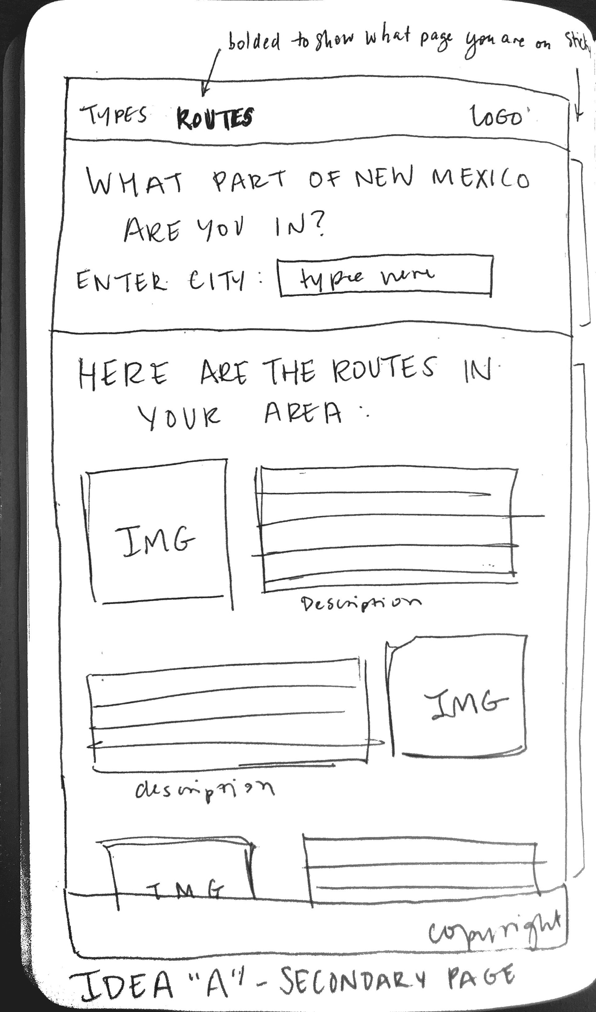
I began my design process with rough wireframes. These wireframes served as the foundation for the entire project. It was important that the overall website felt fun and adventurous to match the energy of rock climbing. The immediacy of the routes page was important so it stayed in the final design. After looking at other websites' navigation bars, I thought it was wiser to place the logo on the left and the page headers on the right.
A majority of this project was completed during the COVID-19 crisis. Because of this, I was unable to take photographs of each climbing location. This impacted my design slightly, as I decided to only have the name and a small description of each climbing route. REI's Mountain Project aided me greatly during the course of this project.
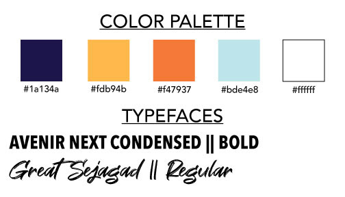
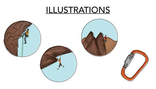
Only two typefaces were used throughout the site, Avenir Next Condensed and Great Sejagad. Each illustration was created in Procreate and incorporated throughout the site.
Using JavaScript, the routes were able to be sorted based on which region in New Mexico that the user was interested in. As mentioned previously, REI's Mountain Project was a great source for finding out all the different information based on the route.