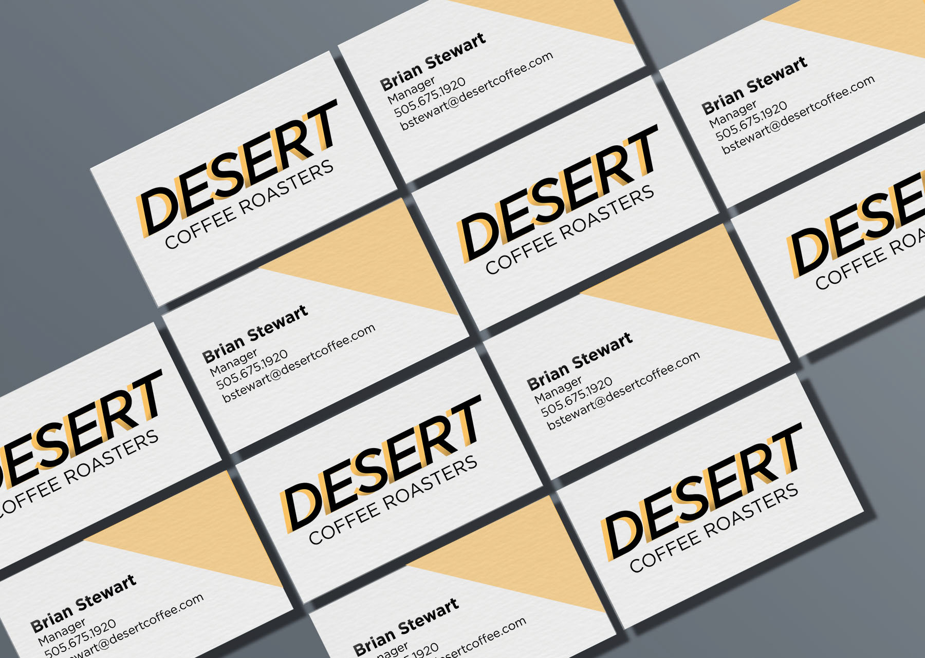
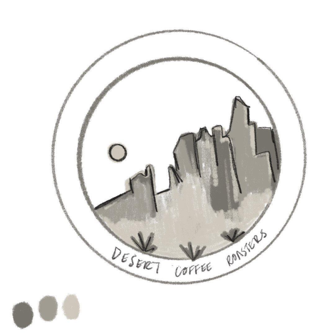
Desert Coffee Roasters is a fictitious brand created to combine my love of the Southwest and good coffee. The brand sought to communicate high end coffee, but also carried the laidback nature of the desert. Through the use of oranges, yellows, and browns, the logo became eye-catching and versatile on different products.
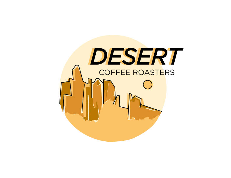
From sketch to final product, the idea was to produce a body of work that reflected the nature of the American Southwest. The logo evolved throughout the creative process. Because English-speakers read from left to right, I decided to flip the original illustration so that the "Desert Coffee Roasters" could hang off the edge.

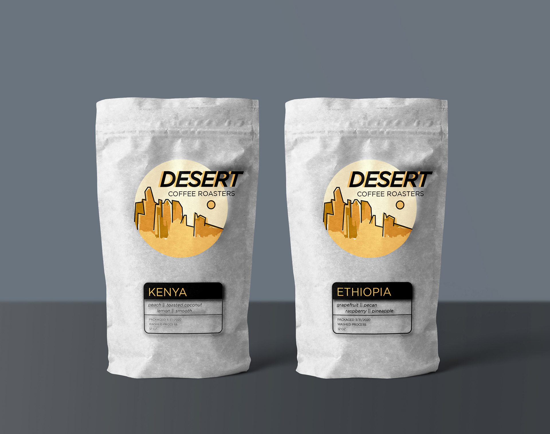
Because Desert Coffee Roasters primary business focus is roasting coffee beans rather than brewing coffee, it was important that the different flavors of coffee had unified branding. Keeping the middle orange tone, the country where the beans were grown stands prominently on the tag.
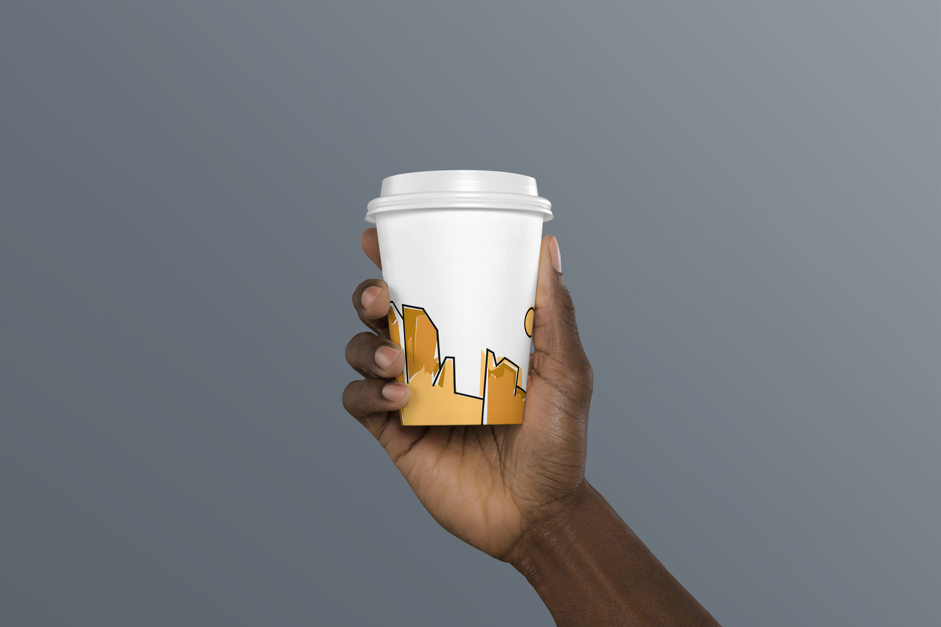
The coffee cup shows just the desert scene. Ideally, this coffee cup could be washed and used for other purposes such as a place to hold pencils. Users might be more inclined to reuse the cup since it does not loudly state the brand's name.
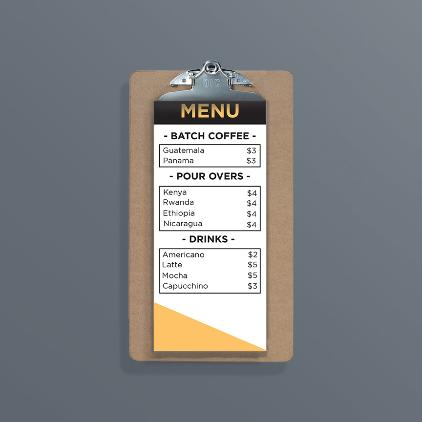
The business cards and menu stick with the geometric theme of the brand by the use of a triangle.